Do you remember physics lessons when optics and light were on the timetable? That was one of the few topics you should have memorized, because when it comes to photography, this topic becomes important again. Here’s a quick refresher and no, it won’t be on the exam.
There are two fundamentally different color spaces when it comes to displaying images and graphics, and we encounter both of them again and again every day.
The RGB color space is used as soon as we watch something on television, on the computer or on the display of our cell phone. This is additive color mixing or light mixing. More on this in a moment.
The CMYK color space is responsible for all print products, newspapers, photo prints, fine art prints. This is referred to as subtractive color mixing.
RGB color space
RGB stands for Red Green Blue(Red Green Blue). These are the primary colors of light. If you send a white beam of light through a prism, the light is deflected differently and the rainbow colors are created.
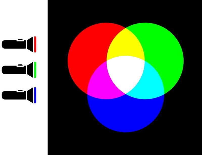
Conversely, all other colors can be mixed from the primary colors red, green and blue. If three flashlights are used, each with a color filter, the overlapping of the light cones produces all other colors, depending on how bright the torch is shining. If all three primary colors are mixed at the same intensity, the result is white; if all flashlights are off, the result is black. This makes it easy to remember why this is called additive color mixing. The more light comes together, the brighter it becomes.
Monitors and displays work exactly according to this principle: light is mixed with different colors. For this reason, you can recognize your monitor even in the dark. This does not work with subtractive color mixing, as we will see in a moment.
CMYK color space
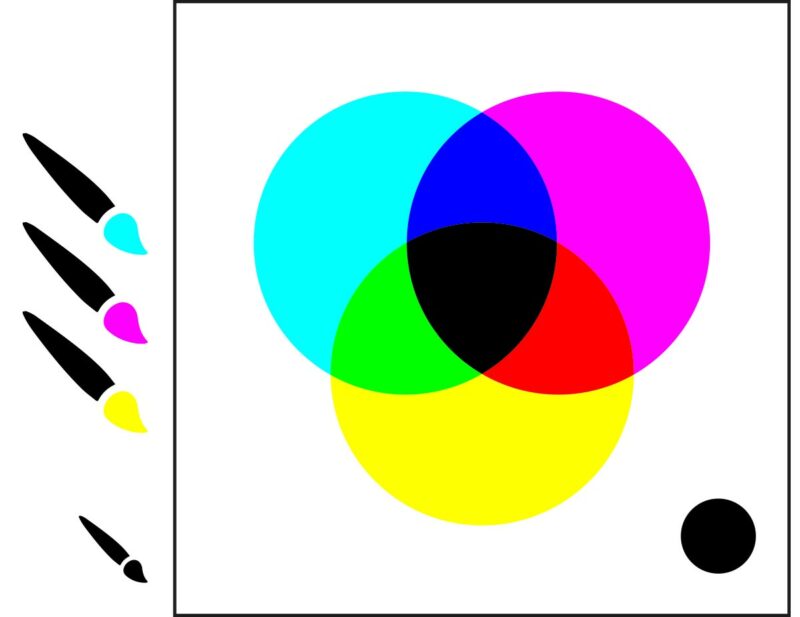
CMYK stands for cyan, magenta, yellow and the K has cheated its way in, which stands for the color black. CMYK comes from four-color printing. This is a subtractive color mixture because the mixture works in exactly the opposite way to RGB. The lightest area on a print or photo is determined by the substrate or paper. If I print a color on the paper, I take something away from the brightest representation, if I put different colors on top of each other, the white becomes less and less to the point that theoretically a black should be created when printing all 3 primary colors on top of each other. But it doesn’t quite do that, because the printing colors are never that pure, it would probably result in some kind of dark brown. For this reason, the fourth color (K) was introduced. On the one hand, this saves an incredible amount of printing ink (only one color is needed for black lettering), and on the other hand, color gradations and dark tones can be achieved more accurately.
A camera always saves the image data in the RGB color space; only when it comes to printing the images do they have to be converted to CMYK so that the printer knows which ink to print in which position.
The conversion from RGB to CMYK is a very complex matter, which I would like to report on in one or more articles.
What you should remember is that the RGB color space is significantly larger, i.e. includes many more colors than the CMYK color space. The art of photography is that the viewer does not notice this.